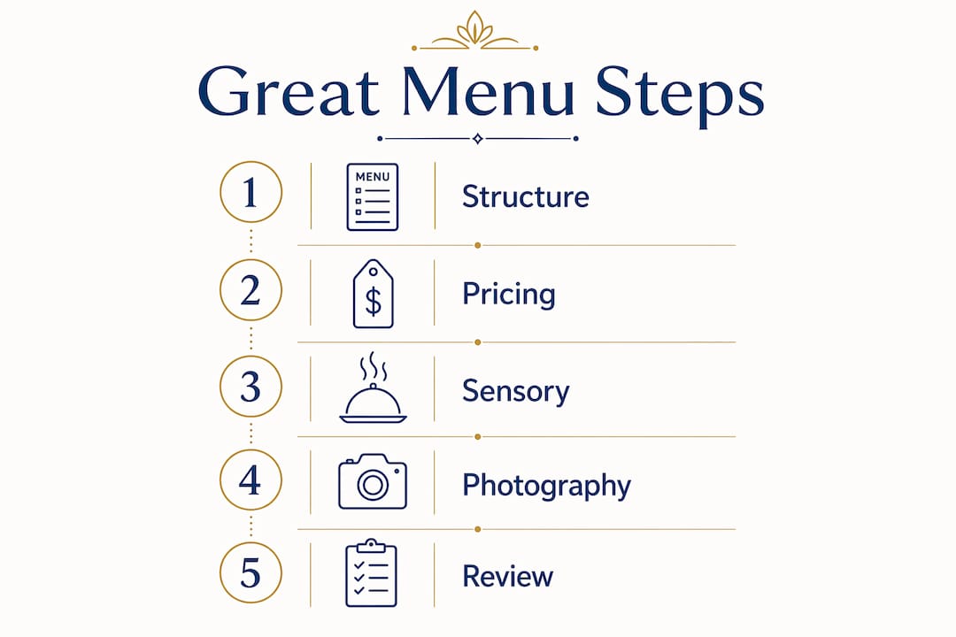
A great menu does three things at once: it guides customers toward the dishes you most want to sell, communicates your restaurant’s identity in seconds, and generates the highest possible margin per cover. Get any one of those wrong and the other two suffer. The core elements that define a successful menu are:
- Readability and clear structure so guests find what they want without frustration
- Optimal item count of 6–8 dishes per category to prevent decision paralysis
- Strategic layout that places high-margin dishes in the zones where eyes naturally land first
- Psychological pricing that reduces cost perception and anchors value
- Sensory descriptions and selective photography that make dishes irresistible before the first bite
- Regular data-driven evaluation using menu engineering to cut underperformers and promote stars
Every section below unpacks one of these pillars with the specifics that actually move the needle.
Design fundamentals that make your menu easy to read
The most profitable menu is the one guests can navigate in under 30 seconds. Readability is not a soft goal; it directly affects how quickly tables turn and how confidently guests order.
Item count per category is the single most impactful structural decision you will make. Limiting each section to 6–8 items reduces the cognitive load that leads to “choice paralysis,” where guests freeze, default to familiar dishes, or simply feel stressed. If your pasta section has 14 options, cut it to 7 and watch average order value climb.
Typography and whitespace do the heavy lifting visually. Use two or three complementary fonts: a serif for section headers, a clean sans-serif for descriptions and prices. Whitespace is not wasted space; it creates breathing room that signals quality and makes individual dishes stand out. Cramped menus read as cheap even when the food is excellent.
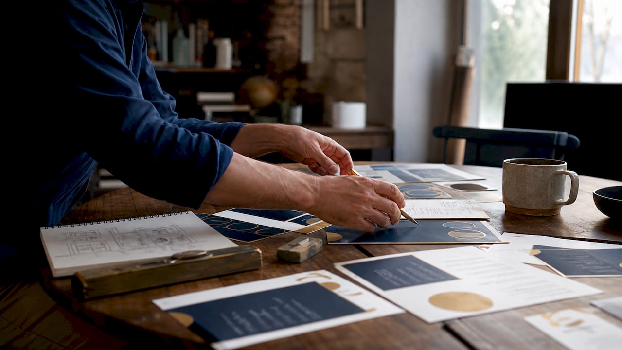
Dietary balance is now a baseline expectation, not a differentiator. A well-structured menu in Central Europe needs clearly labeled vegetarian, vegan, and gluten-free options integrated into every category, not corralled into a single “special diets” section at the back. Guests with dietary needs scan the full menu; if they cannot find options quickly, they order less or leave.
Material and durability matter more than most operators realize, especially in Central European climates where humidity, temperature swings, and heavy seasonal tourism put physical menus through real wear. Laminated or coated card stock, leather-bound covers, and wipe-clean surfaces protect your investment and maintain the premium impression you worked to create. A dog-eared, stained menu undercuts even the best food.
Signature dishes and chef specials deserve visual differentiation: a subtle box, a bold typeface, or a small icon. These markers guide the eye and signal “order this” without requiring a word from the server. Consistent color schemes tied to your restaurant’s branding reinforce identity at every touchpoint, from the menu cover to the plating style.
How psychological pricing shapes what guests order
Pricing on a menu is not just accounting. It is the most powerful behavioral tool you have, and most restaurants use it poorly.
Removing currency symbols is the simplest change with the most immediate effect. Printing “14” instead of “€14” reduces the psychological sting of spending. Guests focus on the dish, not the cost. Pair this with broken pricing, where 13.90 feels meaningfully less than 14.00, and you lower purchase resistance without changing a single ingredient.
Price anchoring works by placing one or two genuinely premium dishes at the top of a category. A high-priced item makes other choices look like bargains, even if those were always your intended bestsellers. Expert menu consultants describe this as “price contrast positioning,” and it is a standard technique in high-performing restaurant menus across Europe.
The three-tier price structure gives guests an easy mental shortcut. Offer one entry-level option, one mid-range option (the one you actually want to sell), and one premium anchor. Most guests gravitate to the middle. Structure every category this way and you are quietly steering orders toward your target margin.
Scarcity and limited-time framing trigger faster, more emotional decisions. “Only available Friday and Saturday” or “Chef’s special, five portions per evening” creates urgency without discounting. Guests perceive limited items as higher quality almost automatically.
Upselling through menu design beats upselling through server scripts. Place a short pairing suggestion beneath your highest-margin mains: “Pairs well with our house Albariño” or “Add truffle shavings for €4.” The guest reads it at the moment of decision, not after they have already committed to an order.
Pro Tip: Never list prices in a vertical column on the right side of the page. That layout turns your menu into a price list and trains guests to scan by cost rather than by appetite. Embed prices at the end of each description instead.
Visual and sensory elements that sell dishes before they arrive
A menu that reads well is good. A menu that makes guests hungry before they finish reading it is great.
Professional photography of your signature dishes can increase sales of those dishes by up to 30%, but the operative word is professional. Poorly lit, low-resolution images do the opposite: they signal low quality and erode trust in the kitchen. The rule is simple: photograph only your stars and the dishes you want to push, and only when you can afford proper food photography. One excellent image per section outperforms six mediocre ones.
Sensory language is where most menus leave money on the table. Describing a dish as “Slow-roasted lamb shoulder, 12 hours, with smoked paprika crust and rosemary-scented jus” does more than inform. It creates anticipation. Research from Cornell University, cited widely in menu engineering literature, found that sensory descriptions boost dish sales by 15%–27%. The mechanism is straightforward: the guest mentally experiences the dish before ordering, and that preview converts.
Storytelling in descriptions adds another layer. Mentioning the origin of an ingredient (“Catalan anchovies, salt-cured for 18 months”), the preparation method, or a recommended pairing gives guests something to talk about at the table. That conversation reinforces the perceived value of the dish and, by extension, the meal. You can see this approach in action at Kokcha’s Mediterranean menu, where ingredient provenance and preparation style anchor each dish description.
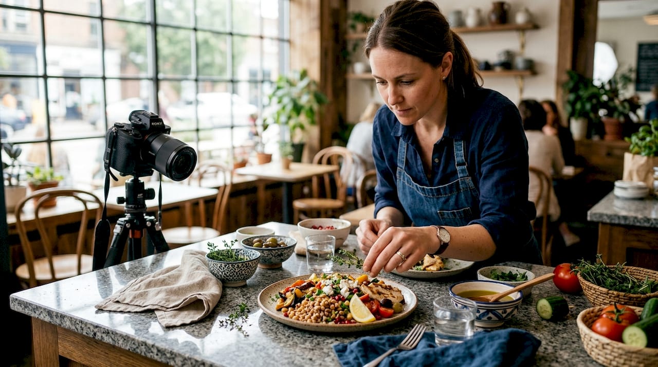
Balancing images and text requires restraint. A menu overloaded with photos dilutes attention; guests stop registering individual dishes and start skimming. The most effective layouts pair one strong image with a tight, evocative description, then let whitespace do the rest. Think of each dish entry as a small advertisement: headline (dish name), body copy (description), and one optional visual.
| Design element | Effect on guest behavior | Common mistake |
|---|---|---|
| Professional dish photography | Up to 30% sales increase for featured dishes | Using low-quality or phone photos |
| Sensory descriptions | 15%–27% boost in order rates | Generic or purely factual descriptions |
| Selective image placement | Focuses attention on high-margin items | Photographing every dish equally |
| Storytelling and provenance | Justifies pricing and builds perceived value | Omitting origin or preparation context |
| Whitespace and layout balance | Improves readability and premium perception | Cramming too much content per page |
The role of food photography extends beyond the physical menu, too. The same images that anchor your printed menu drive engagement on your website and social channels, compounding the return on a single photography investment.
How to evaluate and optimize your menu design effectively
A menu is not a document you design once. It is a financial instrument you tune continuously.
Menu engineering is the formal discipline for this. Developed from adapted BCG matrix thinking, it categorizes every dish by two axes: profitability (margin per cover) and popularity (order frequency). The four resulting categories are:
- Stars: High margin, high popularity. These are your best assets. Give them prime visual real estate and protect their pricing.
- Plowhorses: High popularity, lower margin. Guests love them, but they cost you. Gradually raise prices 2%–5% per year or reformulate the recipe to reduce food cost.
- Puzzles: High margin, low popularity. Something is blocking the sale: placement, description, or server knowledge. Fix the presentation before you consider removing them.
- Dogs: Low margin, low popularity. Remove them unless there is a specific strategic reason to keep them (a children’s option, a dish that anchors a pairing).
Data collection requires at least 3–6 months of sales history to be meaningful, with analysis done within each dish category rather than across the whole menu. Comparing a starter’s popularity to a main course’s is a category error; menu analysis must compare dishes within the same section to produce valid conclusions.
The golden triangle describes the three zones of a menu where customer eyes land first: the top center, the top right, and the bottom right of a two-page spread. Dishes placed in these zones receive up to 30% more attention than those in other positions. Your Stars and high-margin Puzzles belong here. Dogs and low-priority items go elsewhere.
Regular updates tied to seasonality and customer feedback are not optional maintenance. Menus that reflect seasonal ingredients and respond to guest input consistently outperform static menus on both retention and profitability. A quarterly review cycle, at minimum, keeps your menu aligned with ingredient costs, market trends, and what guests are actually ordering.
Staff training closes the loop. A server who can describe a Puzzle dish with genuine enthusiasm converts it into a Star. The menu is the script; the team is the cast. Menu engineering only delivers its full return when the front-of-house team understands which dishes to recommend and why.
Expert insights and research-backed tactics for creating great menus
The science behind menu design has moved well past intuition. Neuromarketing research and hospitality studies now give operators a clear picture of what actually drives orders.
That framing is useful because it reframes the menu from a list into a sales tool. Every font choice, every price format, every image placement is a decision about where attention goes and what gets ordered.
On photography: The 30% sales lift from quality dish photos holds across restaurant types, but the effect reverses with poor images. The threshold is not “some photo” versus “no photo.” It is “excellent photo” versus everything else.
On descriptions: The 15%–27% order rate increase from sensory language is one of the most consistently replicated findings in hospitality research. The mechanism is anticipatory pleasure: guests who can vividly imagine a dish are far more likely to order it.
On profitability: Menu engineering, applied correctly, can increase restaurant profitability by 15%–25%. That is not a small-margin improvement. For a mid-sized restaurant, it represents a meaningful shift in annual net income without adding a single cover.
On item limits: Aguirregoitia and other menu engineering consultants consistently recommend capping each category at seven items. Beyond that threshold, guests experience decision stress and default to familiar choices rather than exploring your higher-margin dishes.
Kokcha applies these principles directly in its Barcelona menu, where Mediterranean ingredients are presented with sensory context, signature dishes receive visual prominence, and the category structure keeps each section tight enough to guide without overwhelming. The approach reflects both the research and the practical reality of serving a mixed audience of local regulars and international visitors near the Sagrada Família.
How Central European culinary preferences shape a great menu
Central European diners bring specific expectations to the table, and a menu that ignores regional food culture leaves both revenue and loyalty on the table.
Seasonal ingredients are not a trend in Central Europe; they are a baseline expectation. Guests in markets like Austria, the Czech Republic, Hungary, and Germany expect menus to reflect what is actually growing and available. A menu that features asparagus in october or strawberries in january signals disconnection from the food culture guests grew up with. Rotating your menu quarterly around seasonal produce also reduces ingredient costs, since in-season items are cheaper and fresher.
Local sourcing and provenance carry genuine weight. Describing a dish as featuring locally sourced pork, regional mushrooms, or wine from a named nearby producer signals authenticity. Tourists in Central European cities actively seek dishes that connect them to the region; local residents respond to the trust signal that comes with named suppliers and short supply chains.
Dietary diversity has accelerated faster in Central Europe than many operators realize. Plant-based options, gluten-free preparations, and clearly labeled allergen information are now expected across all price points, not just in urban fine-dining. Integrating these options naturally into every menu category, rather than segregating them, serves guests better and avoids the implicit message that dietary needs are an afterthought.
Portion expectations and meal structure differ by subregion. Central European diners often expect a clear three-course structure with defined starters, mains, and desserts, and portions that reflect the price paid. A menu that blurs these categories without explanation can confuse rather than intrigue. When you do experiment with sharing plates or tasting formats, label them clearly and explain the concept in a brief line at the top of the section.
Language and accessibility matter for menus in tourist-heavy Central European cities. A bilingual menu, or one with clear English descriptions alongside the local language, removes friction for international guests without alienating locals. The Kokcha approach to navigating Spanish restaurant menus offers a useful model: clear structure, accessible language, and cultural context that enriches rather than overwhelms.
Kokcha: where menu design meets Mediterranean identity
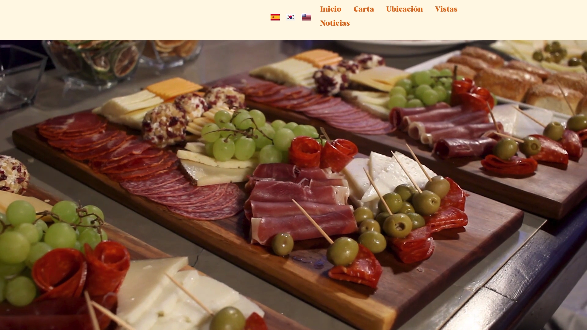
Kokcha puts these principles into practice at its terrace restaurant steps from the Sagrada Família in Barcelona. The menu balances Mediterranean staples like seafood paella and garlic parsley shrimp with clear category structure, sensory descriptions, and a layout that guides guests toward signature dishes without pressure. Whether you are a restaurant professional looking for a live example of these principles or a diner planning a visit, Kokcha’s Barcelona dining checklist covers what a well-run Mediterranean restaurant looks like from the inside out.
Key Takeaways
A great menu combines clear structure, strategic pricing, sensory language, and regular data-driven review to maximize both guest satisfaction and restaurant profitability.
| Point | Details |
|---|---|
| Limit items per category | Cap each section at 6–8 dishes to prevent decision paralysis and guide guests toward higher-margin choices. |
| Use the golden triangle | Place your Stars and high-margin Puzzles in the top center, top right, and bottom right zones where eyes land first. |
| Invest in sensory descriptions | Evocative language tied to texture, aroma, and origin boosts order rates by 15%–27% per menu engineering research. |
| Apply menu engineering quarterly | Categorize dishes as Stars, Plowhorses, Puzzles, or Dogs every 3–6 months and adjust placement and pricing accordingly. |
| Reflect local and seasonal ingredients | Central European diners expect menus to track seasonal availability; rotating quarterly also reduces ingredient costs. |